Graphic Design for Interior Designers
Graphic design skills can be beneficial for not-graphic-designers as well. How can interior designers apply what they know to design documents that cohesively communicate their ideas?
Please note the above embedded video is very poor quality due to upload restrictions on Vimeo. While this is okay for audio playback while scrolling through the website, it's not ideal for viewing. For viewing, the full resolution video can be accessed at this link. Sorry!
Digital lecture (COVID-19 times) for Interior Design Process and Presentation class at Meredith College, offered by Renae Mantooth.
March, 2020
Introduction
Hi! I’m Panda, and I’m in Renae’s PhD class. I hold a master’s degree in Graphic Design from NC State, though my undergraduate education was in mechanical engineering. So I guess I’m gonna call this “graphic design for not-graphic-designers”, cause that’s how I started. But well, you’re interior designers (or are in the process of), so maybe this will be more “graphic design for (not-graphic-maybe-interior) designers” but that title is too long so redacted. Maybe "Graphic Design for Interior Designers" feels appropriately click-baity. Win.
Why Graphic Design?
Anywho. Graphic design, you say? Why do you even need to know anything about graphic design? You’re interior designers, right? Well, in many schools the department that does graphic design actually goes by the name of “Communication Design”, or “Visual Communication”. I.e.--the design of how you’re going to communicate something visually—an idea, a thesis, a project, a product, a story.
We all need to communicate with each other, and do so on a daily basis. But in most cases we use tools already designed for this purpose. The user is only concerned with the content of the communication, they’re not trying to design a medium for communication. Eg, when you text your friend, you’re not thinking about the way your message will be displayed to your friend, how they’ll quickly distinguish between what was sent by you vs. them, or how they’ll view the image (these are all graphic / communication design problems that were solved by designers)—what you’re concerned about is this amazing plate of food in front of you that you want your friend to see (is that still something people do? I do).
While tools for communicating your project to an audience exist (eg. Behance), it’s still helpful to know the basic principles of how you can effectively design a message for good communication. You might have to make a poster for your project. Or design a document. Or a website. Or a presentation, like in this class.

What this is (not)
Before we begin talking about the design, let’s explicitly clarify what this video / lecture / presentation / thing is not, and what it might be. This is not a tutorial for how to use a graphic design tool (eg. InDesign). There are many tutorials for any tool online. This is also not a tutorial on how to do graphic design or typography. You will not get a clear-cut step 1-2-3 out of this. There are books that will explain the intricacies of graphic design and typography much better than I ever can. Then what is this? This is more of a high-level almost theoretical look at how one might think of framing a graphic design challenge when coming from an Interior Design perspective. :)
What is Design?
So how do we start thinking about designing our message for effective communication? It might be helpful to take a step back. Broadly speaking, “design” at its core implies some sort of fulfilment of a purpose. Bridging a gap, solving a problem, meeting a need, etc etc. This is true for any act of design, not limited to specific sub-disciplines within design like interior or graphic or industrial design. It’s a universal design tenet. Then, it’d follow that we can probably look at this process and try and frame our approach to a solution in any other sub-discipline using this as well.
Interior // Graphic
Now Interior Design and Graphic Design, while being two very different fields, carry a surprising lot of common elements. This is great! Because that should mean that we should be able to think about problems in either space by effectively applying the same (or similar) abstract thought processes. So how are they similar?
In either case (interior // graphic), the designer is working out how to lay out content (furniture, decoration // text, images) in space (room // screen or paper). The content must be laid out within the constraints that the space offers (dimensions, material in either case). The content of the room must be chosen (furniture type // type choice) such that it meets the functional requirements as well as reflects the mood that you’re trying to convey.
Let’s look at an example. Many artists and designers upload their work to an online portfolio. Here’s the digital portfolio of Mark Wheeler:
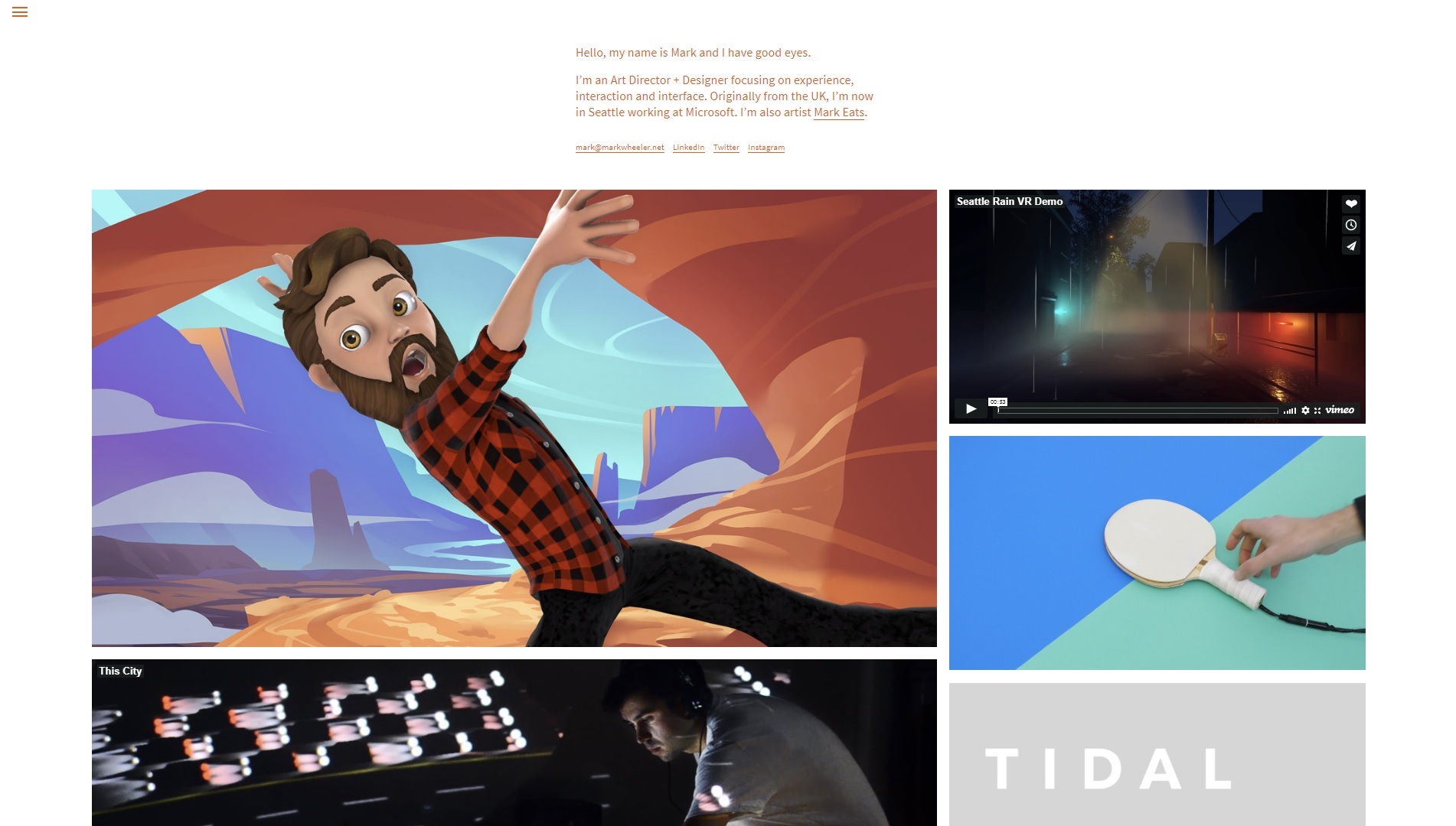
Clean layout, some text to introduce the artist /designer, not much else on the website—the work takes center stage. Was this sort of layout invented by web designers? (spoiler alert : no)
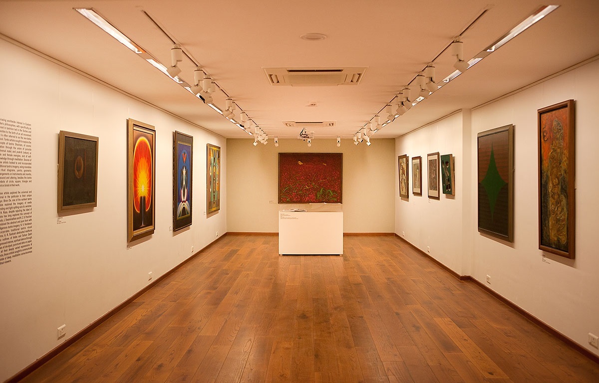
Here’s an example of a physical art gallery. Like the web portfolio, this is also cleanly laid out, with not much else on the wall except a short description of the artist and the art itself. Or rather, the digital portfolio is laid out like the physical art gallery. :)
The thing is, part of the reason they are so similar is that graphic design really draws on the knowledge that we already possess—and designed interior spaces have been around for much longer than websites (or even the printing press) have! So, you’ll often get an appropriately-designed graphic design artefact by copying design elements from interior design artefacts.
Elements of Design Process
So let’s try and break down a graphically-designed artefact into its individual components. I’m going to try and make connections to (my understanding of) interior design along the way—in my head these two design processes are very similar, but maybe that’s because of my naive understanding of interior design—in which case, apologies :)
Space
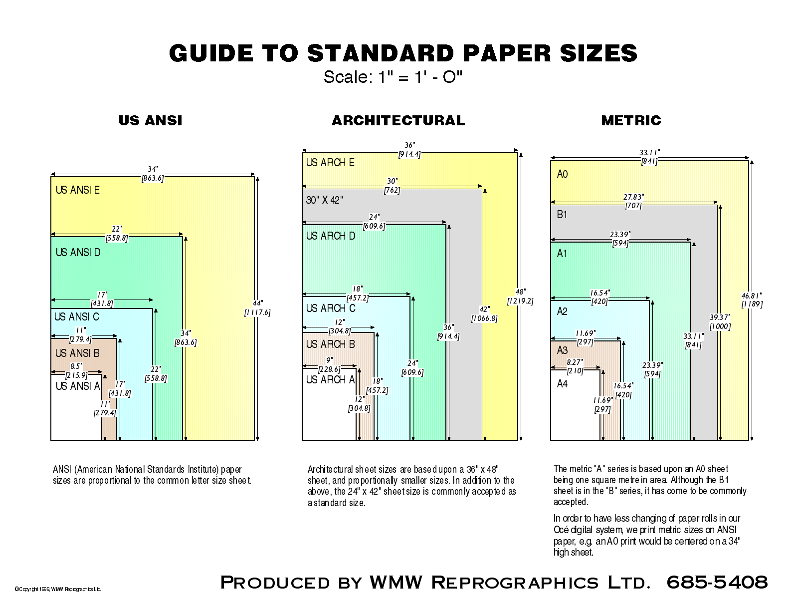
Let’s say you’re designing a poster. The first thing you’ll probably have to do is determine the size of the poster that you’ll have. This will determine what you have available to play with—both in terms of the paper size (area), as well as the orientation and proportions of the space that you have. If it is a digital poster, then you have to think about the display on which it’ll be viewed. If it’s the (now-)standard widescreen display, then your ratio should be 16:9, with the dimensions of the document matching the dimensions of the display.
Now a lot of times this will already be provided to you. For instance, a poster session will mandate that you use a certain size of poster, on landscape orientation. Okay, good. One less thing to worry about. :)
If it isn’t already provided to you, though, then you will have to think about the size in terms of its audience. How many people will view this poster at the same time? How far away will they be when they view it?
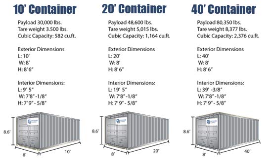
In the interior design process, this is similar to determining the dimensions of the space that you’re trying to design. For instance for your assignment you’re working with ISO standard 40' shipping containers as modules. This was already provided to you, so you’re not determining the size, but you know the space you have available to play with—including the size and orientation.
Function
Now once you have finalized the space, you have to start thinking about a few different things. Firstly, what is the purpose that your design is trying to serve? In my opinion this is the most important element (form follows function!) Is it a poster about a research project? Is it a poster about an interactive music conference? Is it a movie poster? What is the information you’re trying to convey? The answer to the “functional” question will determine what elements you have on your poster.
For instance, for a research poster, you might have a lot of text and diagrams explaining your research. For a movie poster, you might just have the main graphic with the title of the movie, maybe with a release date.
In interior design we might be concerned with stuff like, “oh, we’d need a bed, a table that can seat two, and a sofa” or something along those lines.
Form (follows Function)
Once you have the functional content, now you have to ask yourself, “what kind of message am I trying to convey about this space?”. This will be decided by two things, that go hand-in-hand—how do the individual elements look (visual form), and how do these elements exist in relationship to one another (structural form)?
The visual form of individual elements in a graphic design problem would probably be decided by their typographic properties (if it’s a text element). Alternatively, for a photograph it’ll be stuff like composition, color palette etc. You just have to make sure that the individual elements work together, and seem cohesive visually.
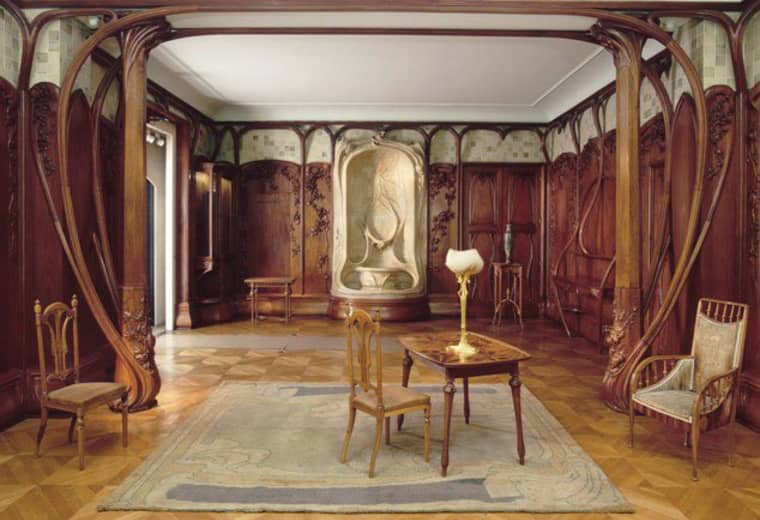
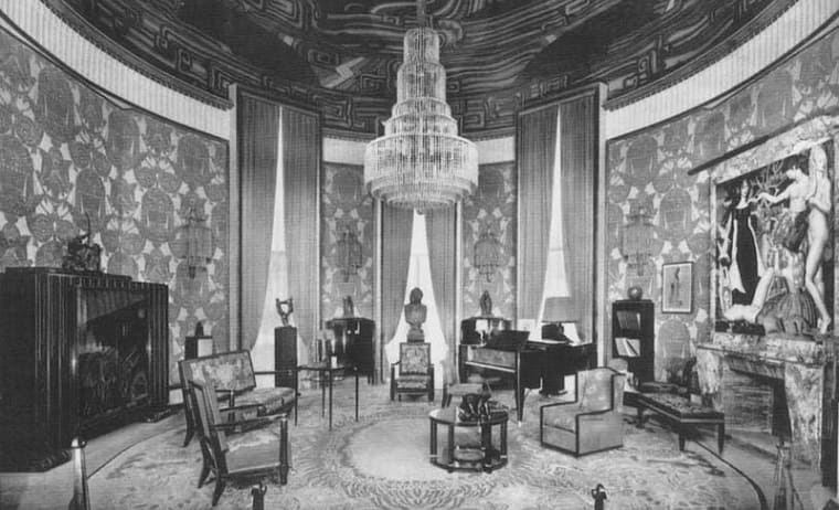
For instance, just like you might not want to mix Art Deco and Art Nouveau furniture, you might also want to avoid type combinations from wildly different styles. Along the same lines, just as you would not use art deco furniture in an art nouveau architecture, you should not use typefaces designed for digital speech bubbles (Comic Sans) in official documents. Or use beautiful typefaces designed for print (eg. Garamond) in coding environments. Practically speaking, though, you don’t have time to learn all about the intricacies of different typefaces, their history. I’d recommend going online and searching for font pairings. One of my favorite demonstrative websites for font pairings is Beautiful Web Type where the author only uses typefaces available on Google Fonts to create beautiful typographic pairings.
Okay, so that was the visual form. However with a lot of stuff we create / occupy, the visual form is basically handed down to us. For instance, research papers might follow the APA guidelines for formatting. You’re going to use double spaced 12pt Times New Roman. It looks horrendous, but it is what it is. Similarly if you’re a student and you ask for a chair from the administration they’re going to give you whatever chair is lying around, not a fancy chair (is Herman Miller fancy?). So the only thing you get to decide in these cases is the structure of the content in your space—give your space the structural form it needs, and it might still hold up!
For structural integrity of the content, my approach is to use a grid system. Look at the space that you have, then depending on the proportions of the space divide it up with either square or proportional grids (eg. proportions of the space you’re working with, or other “standard” ratios like the golden ratio). This helps me in two ways: it makes positioning elements much easier and manageable, since I’m aligning / snapping things to a grid.
More importantly (to me) though, a grid system allows me to work computationally. What do I mean by that? Through a grid system I’m able to define different variable elements that are part of my design, and assign “grid units” to them. For instance, I define the size of the title text to be three grid units, the sub-title to be two grid units, and all the rest of the text to be one grid unit. I define the spacing between any two distinct elements to be a multiple of my grid unit. For instance, the gutter in a web design template might be 1/10 my column size. This enforces consistency in my design. I will not have a random spacing between elements on one page and different on another. A grid forces me to establish a design system, a design language, that bolsters me design’s structural integrity.
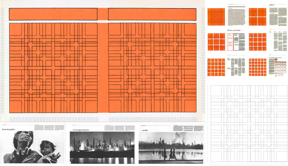
Grid systems are important enough in graphic design practice to warrant grid system templates. There are whole tutorials on how you can use grid systems efficiently, especially in web design (eg. this from tutsPlus). In fact, the current iteration of web design layout styles is built upon a grid system. If you're interested, here's an article by MDN Web Docs.
How does this relate to interior design? Well. I don’t really know if this is common practice in interior design or not, but I would imagine you use grids when making plans? :)
Personally, whenever I am planning on buying furniture I section my room into grids that are meaningful to me. Then I try to use this grid to determine where things will go, and how the stuff will look structurally in the space. Will there be a large enough gap between the different elements in the room, or will it be too congested? Will there be symmetry? If not, would it be intentional?
These are all valid questions to ask for a document as well. Is there enough leading in paragraphs for it to be readable? Is there enough spacing between blocks of text and/or graphical elements? Do the elements have room to breathe, or are they too congested? Is there enough white space? Is the text left-aligned (staggered right)? Centered? Justified? Is your alignment choice justified? :)
If there’s one thing you take away from this, then it would be this: If you’re designing a document that is tied to an interior design project, the strongest advice I can give you is to print out whatever document you’re creating (website, paper, poster, presentation) and imagine this document on the wall of the space you’ve designed. Does the document blend in with your designed space? Why / why not?
This might be a valuable exercise for you to do on your own—choose two-three visually distinct interior design projects from design portfolios online, and try to design a one pager document talking about that design, keeping in mind that the document should be cohesive with the rest of the design—your identity.
Note: Please don’t take this as a reason to simply copy what you have physically to another medium—take advantage of each medium while copying certain design attributes such that it feels cohesive. For example, if designing a digital info web page for your interior design project, make use of what the digital makes available to you that the physical medium might not have—hyperlinks, animations, videos etc. However while presenting this info you can use formal and structural cues from your interior design system.
Context
Now talking about cohesion brings us to a very important part of the design process—the context of your design. Again, drawing parallels with your Interior Design project, you’re designing for Temporary Hospitality in the Sharing Economy, where you’re utilizing shipping containers as modules to situate your designs in. However these containers don’t live on their own. The project brief mentions the physical location, and prompts you to think about the surroundings when you design your rooms. This is vital to a well-designed project.
This same train of thought can be applied to graphic communication. While many times you will be presenting your project alone without an idea of what the surroundings are going to be like, many times you’ll be presenting as part of a team (like for this project). Even though your individual detailed designs will be different, you will be taking your teammate’s plans into account. Similarly, it would be ideal for you to also consider your teammates’ designs in addition to your own when designing your communication material. Also, you will decide stuff like color application and material exploration as a team. These factors are directly transferable to a graphic communication system.
Conclusion
While the applications of the disciplines of graphic and interior design might be very different, having basic skills in either discipline would be beneficial to everyone. Both disciplines have enough similarities in their design process though that one can cross-apply some of these principles on an abstract level to make better-inormed decisions.
Hopefully this would prompt you to think about graphic design assignments (like a poster or presetation design for your interior design projects) in a different way, while helping you approach the challenge with a mindset to get a visually cohesive communication material!