This project explores different methods of visualizing data. The goal of the project was to evaluate visualization techniques, and explore what kind of information such visualizations can convey.
I selected datasets that would normally have no meaningful correlation whatsoever — number of properties sold and the number of fire incidents reported in Raleigh — and tried to weave (false) stories through data. The data sets were acquired from the City of Raleigh’s Open Data initiative.
I filtered down the datasets to only include data for 2014, and loaded them into Processing, which I used to explore and analyze the various visualization methods for different use cases.
This visualization compares the number of fire incidents (orange) vs. the number of property deeds (blue) signed daily in 2014. This is a nice visualization strategy to compare two variables (number of fire incidents / property deeds) which vary with the same variable (day of year), from medium-variance datasets with few outliers that need to be identified and analyzed. In this case, the outliers are clearly instantly visible as the red and blue lines, and the space taken by the data is reduced because of the nature of the visualization.
This visualization compares the number of fire incidents (orange) vs. the number of property deeds (blue) signed weekly in 2014. Here I've overlaid the data for every week one over the other, to get an idea about the weekly tendencies over a year. I could clearly see that the number of fire incidents reported are higher on weekdays by far than weekends, spiking on Tuesdays and Wednesdays, while more people buy property deeds on Friday and Saturday.
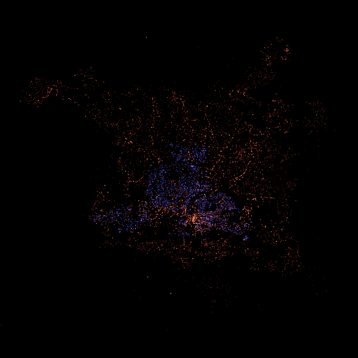
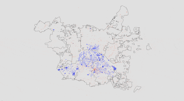
In this visualization, I overlaid each instance of a fire report (orange) and signed property deed (blue), based on the latitude and longitude of their occurence. This interesting juxtaposition of the data gives a good picture of how the city of Raleigh is laid out, which areas are the most populous, and even nuanced details like where the busiest (in terms of residencies) streets run.
Another interesting aspect of this particular visualization is how the fire report data (orange) looks like a fire being fueled by the property deeds (blue) at its core.
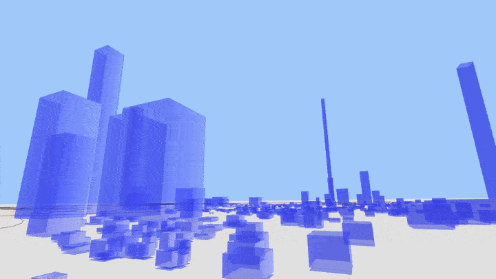
Continuing from the previous visualization, I overlaid the map of Raleigh to the surface, and created a three dimensional visualization, where the property deed locations were extruded to a height controlled by its building value. This gives a very interesting result, as the visualization starts looking like an actual city with buildings.
This three dimensional city map also allows the user to "experience" the data. The user can zoom in to "stand" in the "city", and can gauge the value of a property by looking at its height. For instance, an expensive "buliding" will be very tall, like a skyscraper. Standing next to it, the user can look up, just as he or she would a skyscraper in a physical city. This gives a similar experience for the user as in a physical city — expensive buldings appear taller.
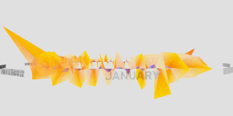
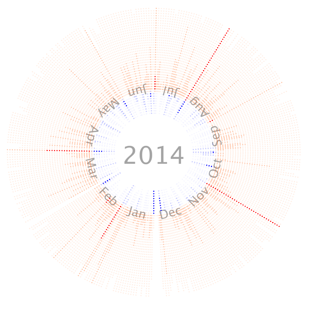
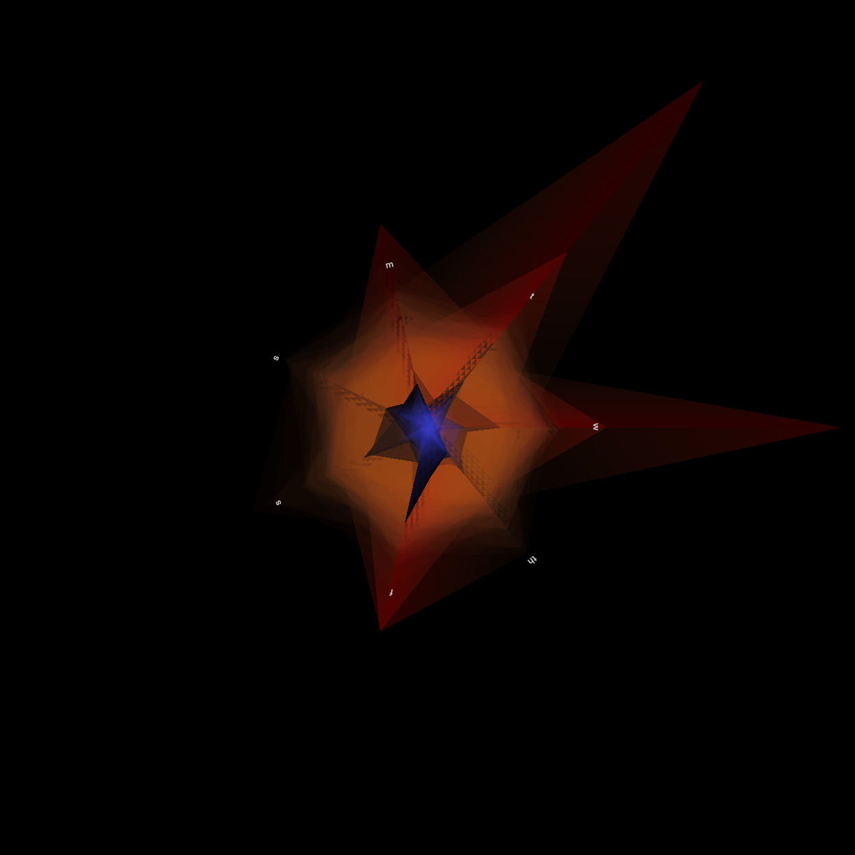
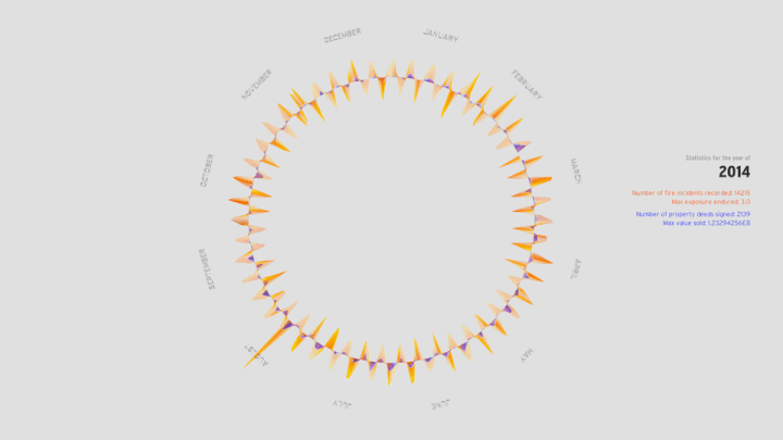
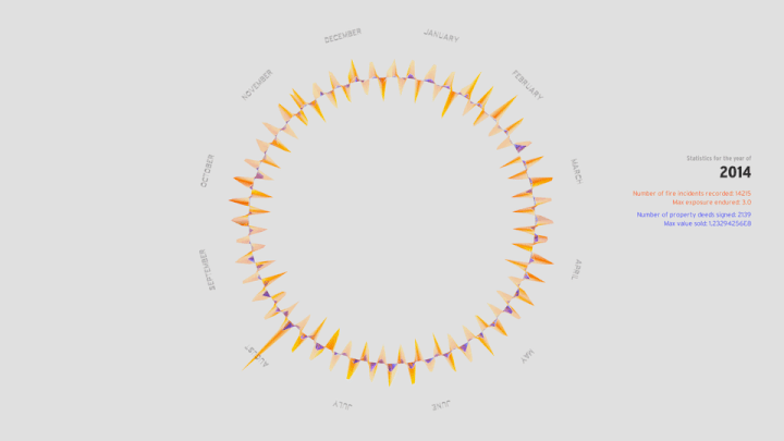
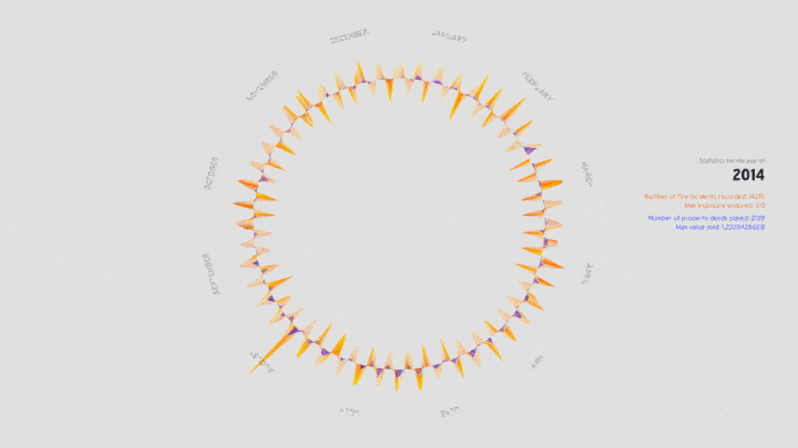
This visualization was an exploration in designing an interface for the user to interact with the data. The visualization depicts the number of fire incident reports (orange) and the number of property deeds signed (blue) over the year of 2014. The helical torus depicts the cyclical nature of time at different levels - the week / month with the helix, and the year with the torus.
From the top view, the user can view statistics about the year being analyzed. If the user hovers over a certain month, then that month is selected and some vital statistics about that month from each dataset is displayed instead.
The user can manipulate the cycles being shown in the data structure. By default the visualization shows data for each week of the year as a helix, that is, the helix that forms the torus has 52 turns for the 52 weeks. The user may want a broader look at a certain month instead, which he or she can do for each individual month as shown here. The helx for that month then changes from a 4-turn helix to a single turn helix.
The user can also navigate through this structure, zoom in and out, and rotate the structure to look at the three dimensional structure from various perspectives to get a better idea about the data and to get intimate with it.